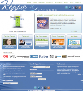
 As you can see (if you’re a regular visitor), today, I’ve launched a new design for Keppie Careers. I’m thrilled to have partnered with Cubicle Ninjas*, who put everything together for this design and made sure it was exactly what I had in mind. The Cubicle Ninjas say this about themselves, and I think it suits the firm perfectly:
We are a dedicated team of creative design and illustration warriors and we would like to be your one-stop marketing resource…We take your projects on like they are our own, so you can focus on doing what you love.
It was great to work with a talented artistic and technical team of people who went above and beyond expectations to create the new look. My main goal with this new landing page and site design was to incorporate targeted visuals and to make it easy for first-time visitors to learn about my services and how I can help both job seekers and business owners succeed with their goals.
Another factor in this redesign was my goal to personalize the page. When you work with Keppie Careers, you get me! I wanted to infuse the site with non-generic images that reflect what I offer, which is different from every other social media consultant, job search or business coach and resume writer.
I’ve always wanted a little less “header” and a more prominent call-to-action to invite you to “subscribe” to my updates. (If you haven’t already, please consider it! (Click on the link at the top of the page! You even get a free ebook when you subscribe.)
I’m also excited to highlight my books. This is a reminder of why it’s good to have input into your book’s cover design — someday, it will probably feature prominently on your website.
Another reason for the redesign? If I’m going to advise other small business owners about how to showcase their online brand, or their VIV-id, as Hannah Morgan and I dubbed it, it’s important that I keep my own site updated and focused on what I offer. I decided against the trend to create a never-ending scrolling site, which you may have seen lately. This choice is a lesson, too: learn about the trends, but only use the ones that work for you.
Finally – I relied on several friends and colleagues to provide feedback along the way. Thank you to all of you — you know who you are — who offered advice and ideas and who served as a wonderful “advisory board” for me.
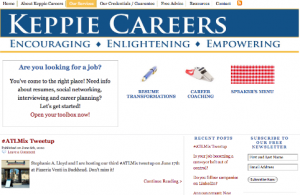
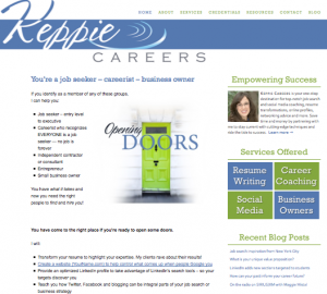
I thought it would be fun to do a little retrospective of my past sites! Do you remember these? If you do, be sure to comment…It’s always great to connect with regular and long-time readers. And, I’ll look forward to meeting you here going forward!
My very first blog design was on WordPress.com and linked to a really basic website. After a year with that setup, I knew it was time to upgrade. (Hard to believe I’ve been blogging for just over five years this month!)

I hired an expert to help move my blog and KeppieCareers.com to one platform. I remember thinking long and hard about the images to represent my services. I chose the checkered tablecloth for the “speaker’s menu,” which was fun, but not perfect, by any means.
 
I enjoyed that first logo (notice the University of Michigan colors?), but I thought it would be great to work with a new professional to create a brand new logo to go with another redesign. We chose the blue and green and the “ripple” design indicating movement. The K on Keppie reaches beyond the blue bar to symbolize reaching beyond where you are now to achieve the next thing! I loved the checkerboard links to my services – this design eliminated a need to find pictures or visuals for those services, which was always a challenge.

The most recent design I just replaced was another upgrade. My services got their own, colorful “buttons,” but I always wanted to personalize it a bit more and to use the landing page’s space more effectively.

Clearly, since I’m on design #5 now as I end my fifth year of blogging, I like to see my webpage design as a bit of a work in progress. I’m sure to add a few tweaks here and there to the newest site, but I hope to stay with this design for a long time! I hope you like it as much as I do!
Thank you for reading my blog. It means the world to me to know that you click over to visit my page. I love when you share or retweet my links — I appreciate it so much. Please keep in touch and keep commenting!
(And, be sure to click to visit the new homepage!)
*Cubicle Ninjas specialize in: Advertising Design, Animation, Brand Creation, Graphic Design, Flash Production, Logo Design, Presentation Design, Illustration, Web Design, Motion Video Production and Sales Enablement Design